Candlestick charts show the development of a value over time. Candlestick charts are often used on the stock exchange to show the price development of shares or indices. The individual candles in the candlestick chart show the first price, the last price, the highest price and the lowest price of a certain period. In a daily chart, for example, each candle shows the high price, the low price, the opening price and the closing price of a day.
Candlestick charts are often used in technical analysis of stock market prices.
Sometimes candlestick charts are also called candlestick charts or candlestick charts.
What are candlestick charts?
Candlestick charts are used in the analysis of crypto market prices to show the price trend of a cryptocurrency.
In a candlestick chart, each individual candle shows how the price has developed within a certain period of time. In a daily chart, for example, each candle represents the price development within a specific day. If, on the other hand, a weekly chart is viewed, each candle shows the price movement within a week.
The individual candles show the first price (opening price), the last price (closing price), the highest price and the lowest price of the period under consideration.
Candle with explanations
Each candle consists of a box-shaped body in the center of the candle and two lines protruding above and below the box.
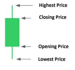
The upper and lower boundaries of the body indicate the respective opening price and closing price.
- If the closing price is above the opening price, the box is drawn in green. In this case, the price has risen in the course of trading.
- If, on the other hand, the price has fallen, the closing price is below the opening price and the box is drawn in red.
Occasionally, it happens that the price closes at the same point where it opened. In this case, a straight line is drawn in place of the body. This candlestick shape is called a doji.
The two lines above and below the body are called shadows. The top of the upper shadow indicates the highest price of the period under consideration, while the lower shadow marks the lowest point.
What information can be gleaned from the shape of each candle?
The shape of the candles tells a lot about how the price has developed in the period under consideration. From the length of the shadows and the size of the bodies, we can conclude how the price behaved during the period under consideration. You can find some examples of this in the two charts below.
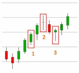
1. a long body with small shadows indicates a strong upward movement (green body) or downward movement (red body).
2. on the other hand, if a candle has only a very small body and at the same time long lower and upper shadows, this indicates a strongly fluctuating trade without a clear trend.
3. A very long shadow in one direction indicates a trend reversal. A long lower shadow indicates that the price fell sharply at a certain point. Then, however, a strong countermovement started and the price recovered most of its losses by the end of the trading session.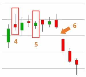
4. exactly the opposite case occurs with a long upper shadow. Here, the price rose sharply, but could not hold its high and had to give up most of its interim gains at the end.
5. if the highest price and the lowest price of a candle are very close to each other, this indicates uneventful trading.
6. gaps are gaps between two candles. These price gaps occur when the following candle opens significantly above (upward gap) or below (downward gap) the previous candle.
A gap remains visible on the chart only if the price does not move back in the direction of the previous candle, thereby closing the gap.
- An upward gap indicates that there were significantly more buyers than sellers at the opening of the market.
- Conversely, a downward gap indicates that there were significantly more sell orders than buy orders before trading opened.
Upward trends, downward trends, and sideways movements
In a candlestick chart, uptrends, downtrends, and sideways movements are relatively easy to identify.
- In an upward movement, the candles close above the closing price of their pre-candles. Within the upward movement, there are clearly more green candles than red candles.
- In a downward movement, on the other hand, the red candles predominate. Most candles within the movement close below the closing price of their pre-candles.
- As the name suggests, the price moves sideways in a sideways movement. The candles move up and down within a narrowly defined range. In the sideways movement, the candles often change color.
Short-term compression zones and breakouts
Next, we look at how the individual candles in the candlestick chart are related to each other.
A common pattern in the candlestick chart is compression zones, where several consecutive candles oscillate up and down in a tight box ( point 1 ).
The bodies of the individual candles all lie more or less on one line.
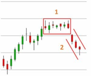
In many cases, all candle bodies additionally lie within the two shadows of the largest candle.
Within this box, the price fluctuates inconclusively back and forth between two narrow frames, without being able to form a clear trend.
If the price finally succeeds in breaking out of this box, there is often a violent, steep price movement in the direction of the breakout ( point 2 ). However, before the breakout from the box, it is not possible to predict in which direction the breakout will occur. Therefore, wait until the first candle closes outside the box before entering.
Resistances and support lines
Significant highs or lows often form resistance zones for subsequent price movements. So at these points, the price is more likely to bounce off the same point again and turn back in the opposite direction.
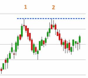 These resistance zones are even stronger if the price has already bounced off the same point several times.
In the chart on the right, you can see such a resistance zone. Here, the price has bounced off the same line twice, at point 1 and at point 2.
This high is now interesting for two reasons:
First, there is a particularly high probability that the price could turn downward again at this point.
At the same time, however, a breakthrough this resistance line would be seen as a particularly bullish sign. Many traders see the break of such a resistance line as an indicator for further rising prices and therefore enter the value shortly after a breakthrough. Therefore, after a break of this line, there is an increased demand, which drives the price further up.
Before entering, however, it is advisable to wait whether the candle closes at least above the resistance line. Sometimes bull traps occur precisely at such resistance lines, where traders enter in anticipation of rising prices, only to be confronted with a sudden countermovement shortly thereafter.
Once the price has moved above the resistance line for an extended period of time, the resistance line becomes a support line. A support zone is thus formed along the former resistance line, making it more difficult for the price to fall below the former resistance line again.
The post How to read candlestick charts correctly appeared first on Fat Pig Bitcoin & Altcoin Signals.
https://ift.tt/3EtBfni


Nenhum comentário:
Postar um comentário